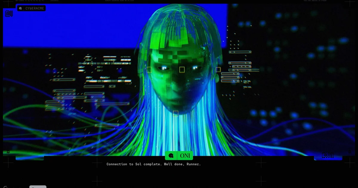
If extraction shooters are games where you step away from the chaos between rounds to review what you’ve taken, then I guess I’m leaning into Marathon in the right spirit. I struggle to keep up with the pace of a squad, let alone provide meaningful help to teammates, and in most fights I feel pretty ineffective. Still, when the match ends, I’m just as eager to dig through what I earned.
For me, the difference is that my rewards aren’t the small bits I pick up while sprinting around the maps. They’re screenshots I’ve grabbed when I really should’ve been doing the searching. I’m not as hooked on Marathon itself as I am on its world and its visual identity. I don’t believe my aim is to push further through the campaign or chase the biggest, newest weapon. Instead, I keep trying to read between the lines of the game’s mood board. So far? I’ve got a few ideas that might be a little unconventional.
A quick note up front: part of Marathon’s mood board has previously included work made by other people, used without their consent. During the game’s development, the artist Fern Hook—also known as Antireal—realized that their creations had been folded into the title without permission. Bungie investigated and admitted the mistake, and Antireal later posted online that the issue had been resolved.
It’s not exactly a cheerful story, even if the ending is positive. Still, Antireal is now credited in the game as a “visual design consultant,” which feels appropriate and at least gives Antireal a measure of closure. That makes sense too, because while Marathon may have removed Hook’s specific pieces, Hook’s style and imagination show up across the game in multiple places—these elements are tied together. (The same idea applies to The Designers Republic, whose “Maximum minimalist” approach—an expression I’ve just come across and now fully back—also influenced artists such as Aphex Twin and games like Wipeout.)

What has genuinely surprised me, though, is just how much Marathon manages to summon. It brings together a mix of wild ingredients while still feeling unified. In my view, that’s a real accomplishment. Marathon can be varied without losing its sense of togetherness.
My theory so far—though calling it a “theory” might be generous—is that so much of this works because Marathon is built in layers. In a surreal sci-fi setting, the first layer, at least in the maps I’ve seen, is made up of glossy black rocks and barren stretches of landscape. It reminds me of that earlier era when Hollywood space movies often borrowed their extraterrestrial scenery from Iceland.
Above that sits another layer, filled with the remnants humanity has left behind in this corner of the universe. Vehicles, modular structures, walkways, and huge spaceships—these are familiar building blocks in lots of video games. The difference is that they rarely look like this.
My theory so far—though calling it a “theory” might be generous—is that so much of this works because Marathon is built in layers…
When it comes to shapes, Marathon seems to take cues from major chunks of the world’s supply chain. There are makeshift warehouses and loading areas everywhere, and in a recent match I walked through a canyon scattered with what looked like unusual variants of specialist vehicles you’d normally see servicing planes at airports. The game’s huge spaceship adds to that feeling as well. I was looking at it the other day through my uncorrected long-distance sight while I cleaned my glasses, and its modules and layout reminded me of both a container ship and what I picture an online shopping fulfillment hub might look like.
Still, there’s yet another layer. Even though this one includes everything from ladders and sliding doors to power systems, it’s presented in strikingly distinctive ways. Pinks, yellows, and cyans make the buildings feel like children’s blocks dropped across the ground. Yesterday, I noticed a run of two-story-tall orange, diamond-shaped objects—some leaning over—that looked a lot like the cheerful packaging from skincare brands such as Byoma and Drunk Elephant: rounded curves everywhere, with the straight edges softened; thick plastic and injection molding you can almost imagine.
Next is the layer made for human-sized items, which plays nicely with the larger structures in interesting ways. In this future, people still use laptops, but they also have a range of multi-screen setups for hacking and healing. The terminals feel like a 1970s vision of the future, burgers arrive in what look like padded envelopes, and other hardware is wrapped in containers that resemble burger boxes.
But it’s the following layer that grabs me most. Almost every surface is covered with text-like chatter, serial numbers, barcodes, and the brilliant typography work associated with The Designers Republic. There are also bits that look like parts of QR codes and other eye-catching visual clutter—print registration marks like the ones you see in magazine corners or along cereal box folds. To my untrained eye, they also call to mind ordnance survey map markers, or possibly the small tabs used in motion-tracking systems. And since this is happening in space, you get cross-shaped fiducial markers similar to those shown in Apollo Mission imagery. Honestly, nothing quite captures the red tape of the cosmos like this.
I hadn’t fully appreciated how well everything was falling into place until I got a package in the mail yesterday. It carried the strange, hard-to-explain marks of its trip to me—covered in stickers, smeared with computer-like characters, and layered with all that visual noise I only notice at least some of the time. It looked as if it had been hauled straight out of Marathon. In a sense, Marathon leans on a collection of half-familiar details to suggest a universe of baffling supply-chain complexity and manufacturing craftsmanship.
And just as importantly, among the oversized flat-pack components, the Icelandic landscape, and those smaller stickers, along with the coffee cups and the loot you collect, plus the safety notices scattered around, Marathon adds another layer. It brings in these tiny bursts of oddness. Some buildings appear connected through something that looks remarkably close to the inside of a Centre Parcs waterslide—one such example shows up in the tutorial. The game’s user interface also includes glitches and visual artifacts: a few parts feel like older Geocities-style pages, while others resemble printed directions for opening a Tetra Pak, echoing the virtual-reality antagonist associated with a late-1990s immersive sim.
When you think about how it pulls from the Backrooms and Demoscene traditions, it becomes clearer to me why Marathon manages to feel both stunning and engaging without ever tipping into being quite overwhelming—and why it stirs up feelings that are both modern and nostalgic.
So, Marathon is an extraction shooter, and its visual identity appears to be assembled from design choices its developers understood while working at speed. (In Antireal’s case, naturally, it’s far too much.) I start the game not only because I enjoy the weapons—though I do have a soft spot for the Edge Mag pink splashes—but because there’s always something new to catch, and something to think through.